When it comes to family photography, color isn’t just decoration it’s communication. Every hue, every shade, every soft pastel or deep tone in your photos silently tells a story. From the warmth of golds and oranges to the calm of blues and greens, color choices influence how your photos feel, what emotions they evoke, and even how timeless they appear.
At Phein Studios, we believe colors can speak louder than words especially in family photography. As an experienced family photographer in Melbourne, we’ve seen how the right color palette can turn a simple portrait into a memory that radiates love, connection, and identity.
Let’s explore the fascinating world of color psychology and how it shapes the way your family story is told through your photos.
The Emotional Language of Color:
Before diving into outfit combinations or background choices, it’s important to understand that colors carry emotional weight. Whether consciously or not, we associate certain feelings and memories with different shades.
Here’s a glimpse into what some popular color families symbolize in photography:
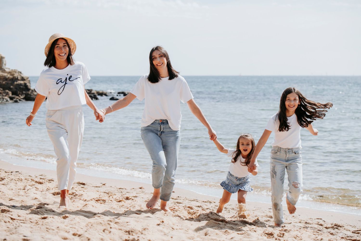
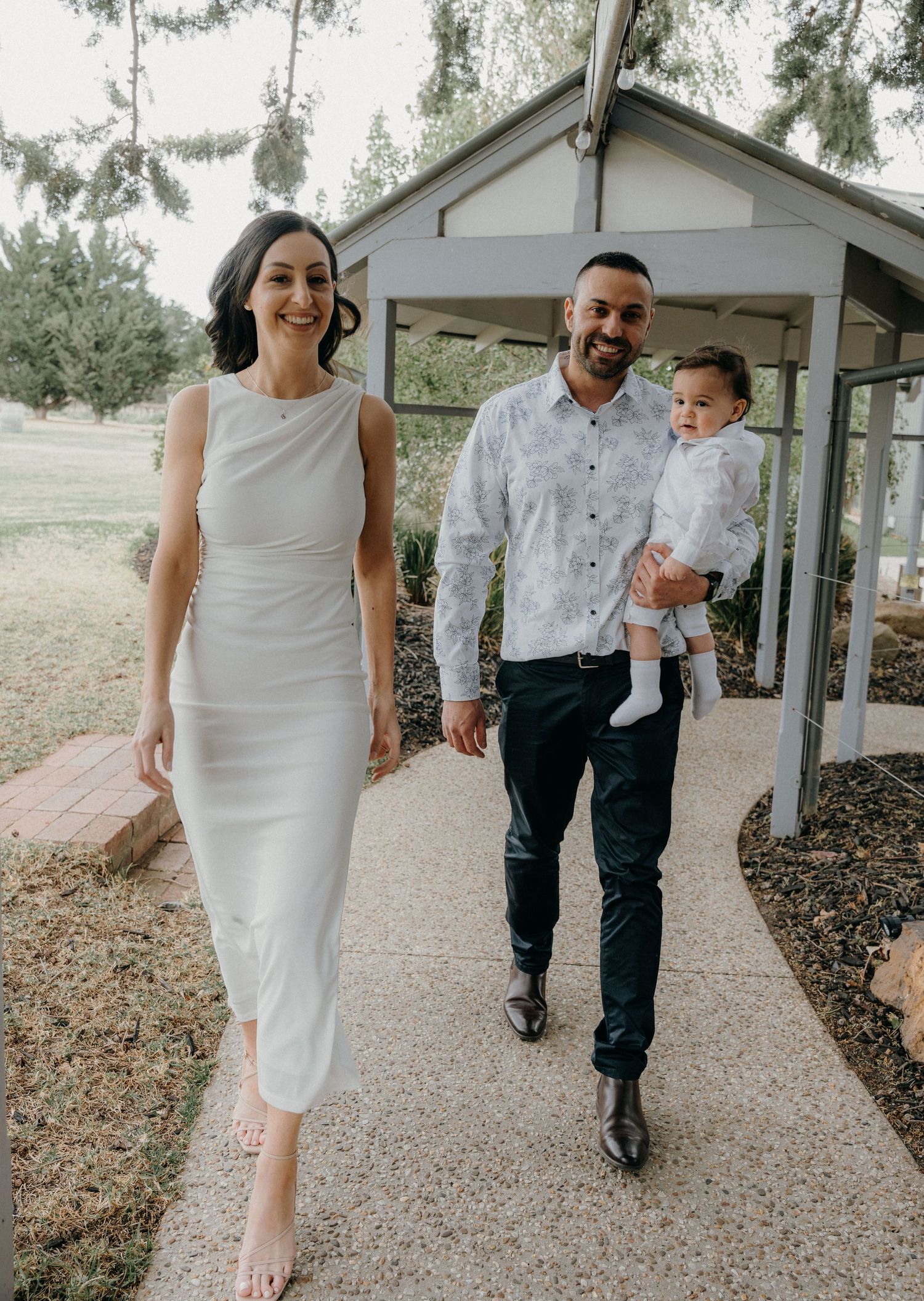
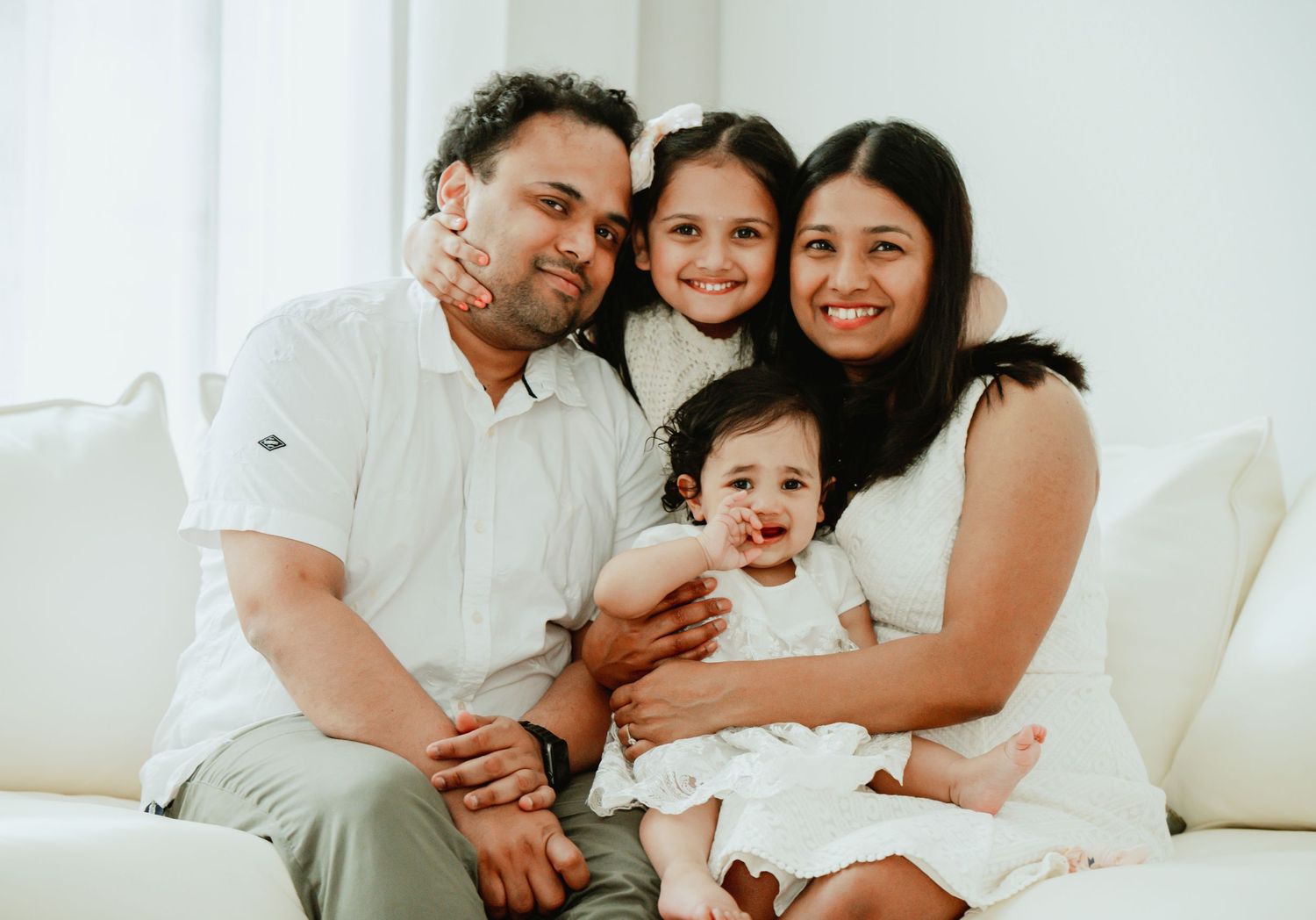
White & Creams → Purity, simplicity, and unity. Ideal for a clean, timeless family look.
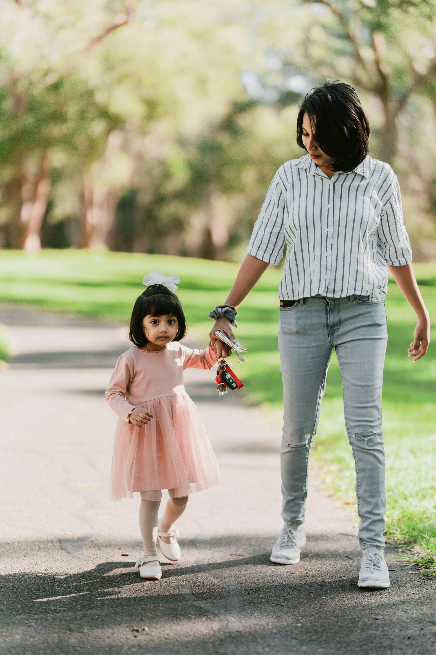
Blues & Greens → Calmness, balance, and harmony perfect for relaxed outdoor sessions in Melbourne’s gardens or coastal parks.
Yellows & Oranges → Energy, warmth, and joy they instantly bring life and positivity to your portraits.
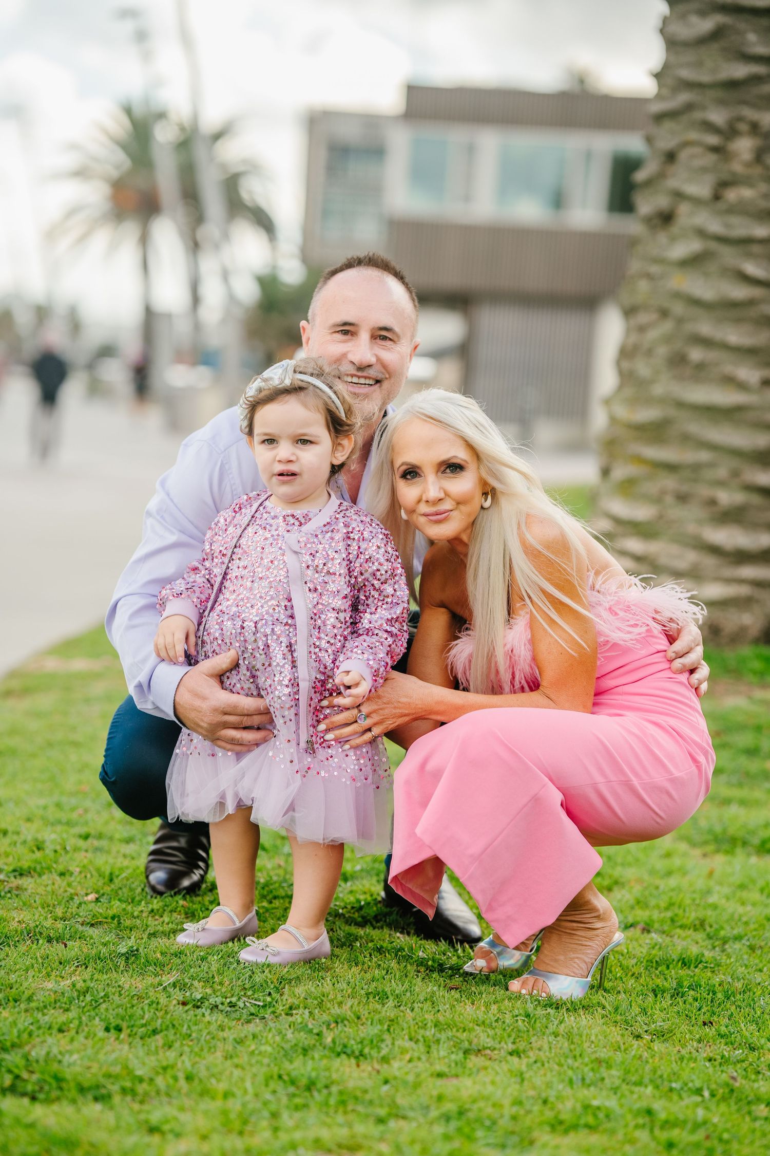
Pinks & Reds → Love, affection, and vibrance ideal for families who want to showcase closeness and emotion.
Neutrals & Earth Tones → Grounded, authentic, and timeless. Great for storytelling sessions in nature or at home.
Understanding this psychology allows you to be intentional to choose colors that represent your family’s personality and energy.
Setting the Tone: Choosing a Palette That Reflects Your Story:
Every family has its own rhythm some are playful and loud, others calm and reflective. The colors in your photos should mirror that.
For vibrant families: Think mustard yellows, coral reds, and forest greens. These bring out your fun-loving, adventurous side.
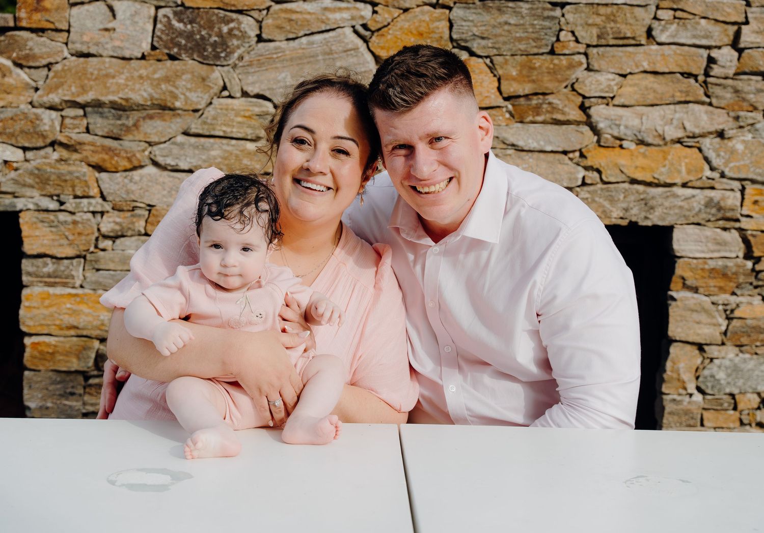
For gentle, soft-natured families: Go for pastel pinks, muted blues, and warm taupes. These hues give your photos a dreamy, emotional quality.
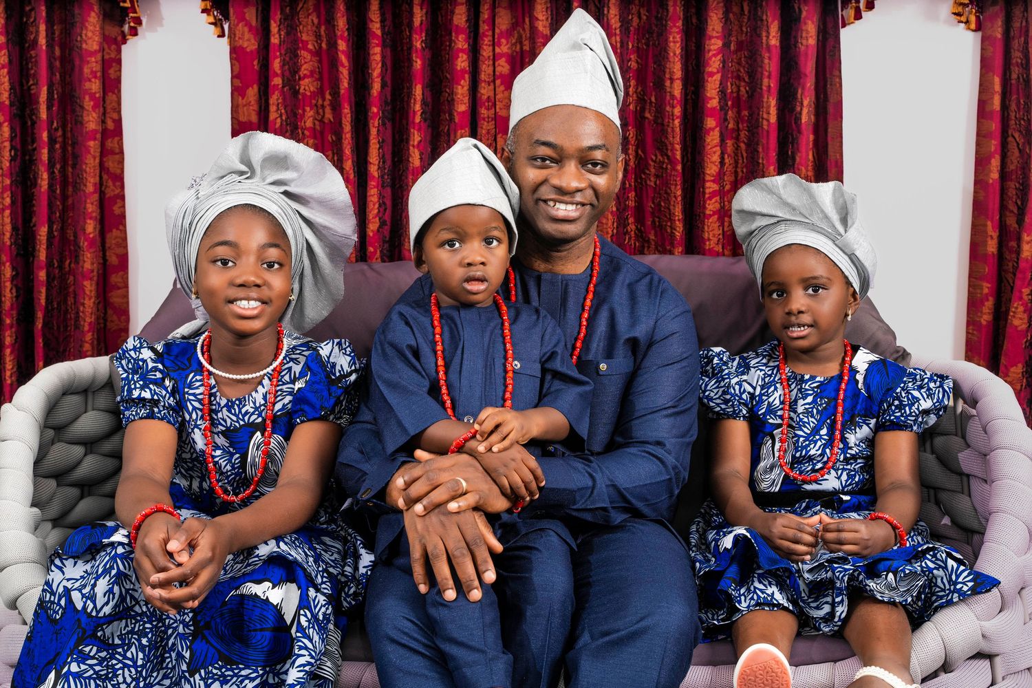
For elegant, modern families: Monochrome tones like ivory, navy, and charcoal exude sophistication and unity.
When you book a shoot with Phein Studios, we guide you through mood-based color styling. As an experienced family photographer in Melbourne, we match your palette not just to your personalities, but also to the season, light conditions, and backdrop ensuring every frame feels natural and intentional.
The Power of Coordination (Not Matching!):
One of the most common misconceptions in family photography is that everyone should match. But matching like everyone in white shirts and jeans can actually flatten the visual story.
Instead, think coordination. Choose a color family and let each person express themselves
within it. For instance:
- Start with a base color (like navy or beige).
- Add accent tones (like mustard, rust, or sage).
- Finish with textures or patterns that complement rather than compete.
This approach adds depth, movement, and individuality to your portraits while still feeling cohesive.
At Phein Studios, we often suggest families bring two outfit options: one casual and cozy, one polished and classic. This way, you capture both sides of your story the laughter and the legacy.
Seasons & Their Color Stories:
Melbourne’s landscape changes character with every season and so should your color palette.
Spring – Fresh & Airy
Think soft pastels, whites, and light blues. Blooming gardens in places like the Royal Botanic Gardens or Fitzroy Gardens pair beautifully with gentle, floral tones.
Summer – Warm & Playful
Golden sunlight and vivid skies make bright colors pop. Coral, mustard, and turquoise look stunning against Melbourne’s coastal backdrops.
Autumn – Earthy & Romantic
The city’s parks turn into canvases of amber and crimson. Deep greens, burnt oranges, and maroons create beautifully moody, nostalgic images.
Winter – Moody & Minimalist
Cooler tones like navy, grey, and cream suit overcast skies and urban settings. They evoke closeness and sophistication.
As a family photographer in Melbourne, Phein Studios adapts color choices not only to your family’s story but also to the natural palette of the season ensuring your photos look cohesive and timeless.
How Lighting Changes Color Emotion:
Light can completely transform the mood of a photo even when the colors stay the same.
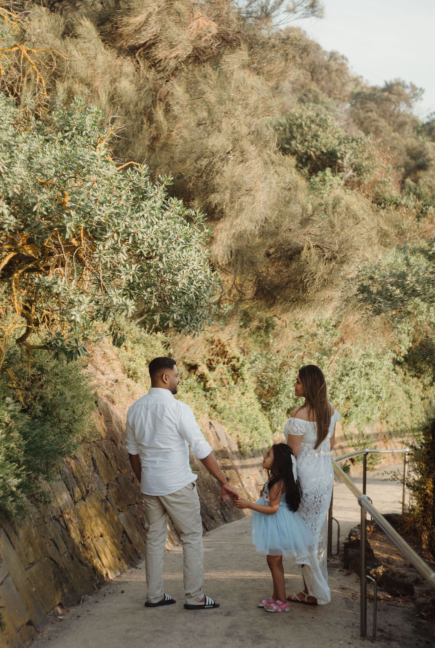
- Golden hour (sunrise or sunset) amplifies warmth, creating soft, glowing tones.
- Midday light makes colors sharper and more energetic.
- Overcast skies soften saturation, adding intimacy and calm.
We at Phein Studios love using Melbourne’s natural light to shape emotion. Whether we’re shooting under the city’s famous golden sunset or in a softly lit botanical garden, the light becomes part of your family’s color story.
Telling a Story Beyond the Pose
Colors don’t just look pretty they communicate relationships.
For example:
- A child in yellow between parents in navy and white can symbolize brightness and joy at the heart of the family.
- A family dressed in varying shades of green may represent growth and harmony.
- Muted earth tones can reflect comfort, calm, and togetherness perfect for cozy, candid storytelling sessions.
When curated thoughtfully, your color choices become visual metaphors for your bond something Phein Studios, as a storytelling family photographer in Melbourne, specializes in capturing.
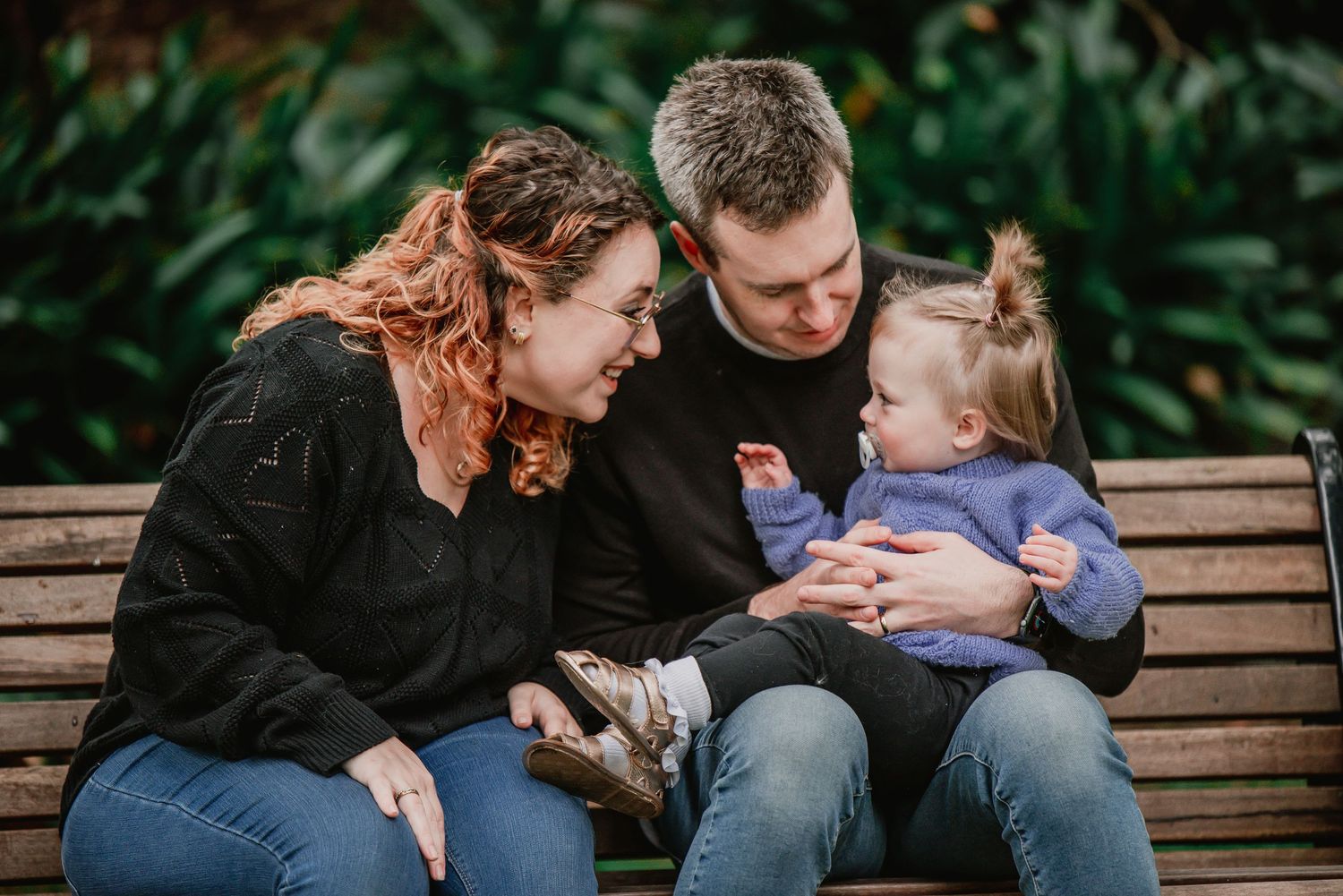
Creating Timeless Images Through Color Balance
Trends come and go, but timeless family photos rely on balance. Avoid extremes overly bright neons or overly muted greys unless they reflect your authentic style.
A good rule of thumb:
- Stick to 2-3 main colors.
- Mix in one neutral tone to ground the palette.
- Use small accents (like accessories or props) to highlight personality.
This way, your photos will still feel stylish 10 years from now.
Beyond the Photo How Colors Influence Memory
There’s a reason certain photos become your favorites: color affects emotional recall. Warm tones trigger nostalgia and joy; cooler tones invite reflection and calm. When you look back at your family portraits, the colors can instantly transport you to the moment the laughter, the hugs, the feeling of belonging.
That’s the power of thoughtful color storytelling something we at Phein Studios deeply value in every session.
Final Thoughts: Paint Your Legacy with Color
Family photography isn’t just about what you wear it’s about what those colors say. Each hue becomes a brushstroke in your family’s visual legacy, capturing your personalities, your bonds, and your shared joy.
At Phein Studios, we don’t just take photos we craft color-driven stories that feel real, heartfelt, and timeless. If you’re looking for a family photographer in Melbourne who understands how to balance emotion, environment, and color harmony, we’re here to help you create art that truly represents you.
Because in the end, every family tells a different story and color is how that story comes to life.